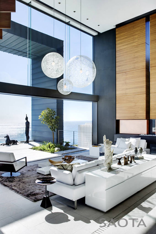
“The brief was to create a building that maximised the connection with the view and the sea, create a garden on the mountain side of the site and to minimise views over neighbouring buildings,” says Greg Truen, Project Partner. The site is positioned on the side of Lion’s Head and has fantastic views over the Atlantic Ocean to the west.
Doubled Volume Space.

The decision was to create a double volume space at the top of the site that could connect the garden court to the east, while also taking advantage of the views over the ocean to the west. The entrance hall is a dramatic, vertical space and provides a counterpoint to the living spaces. The volume of this large area is modulated by the floor which has two levels, and by the bedroom floor which floats into the space and is hung from the roof.

This element, which has a soft s-curve, contains the master bedroom and its ancillary spaces are separated from the living room double volume by a set of walnut shutters. “The building provides a volumetrically dramatic and dynamic interior space on a grand scale. The objective of the interior décor was to create a softer and intimate counterpoint whilst not jeopardising the clean, geometric lines of the architecture.

These elements can harmoniously co-exist and work off each other,” says Adam Court of OKHA Interiors. By utilising a broad base of textures and finishes, the décor feels natural and subtly organic, comfort being of paramount importance at all times; the overall ambiance is one of calm and serenity.
Full interior design gallery for this house.


House Plans
Photographs: Adam Letch
Architects: SAOTA
Interior Design: OKHA Interiors
Table of Contents


